Laying out the Builder.IO Page Content Manually
Upon creating a new page (or editing an existing page), you will see the following layout. All pages will use the same Header and Footer. Everything else in between, is controlled by Builder.IO and whichever components you add into the page.
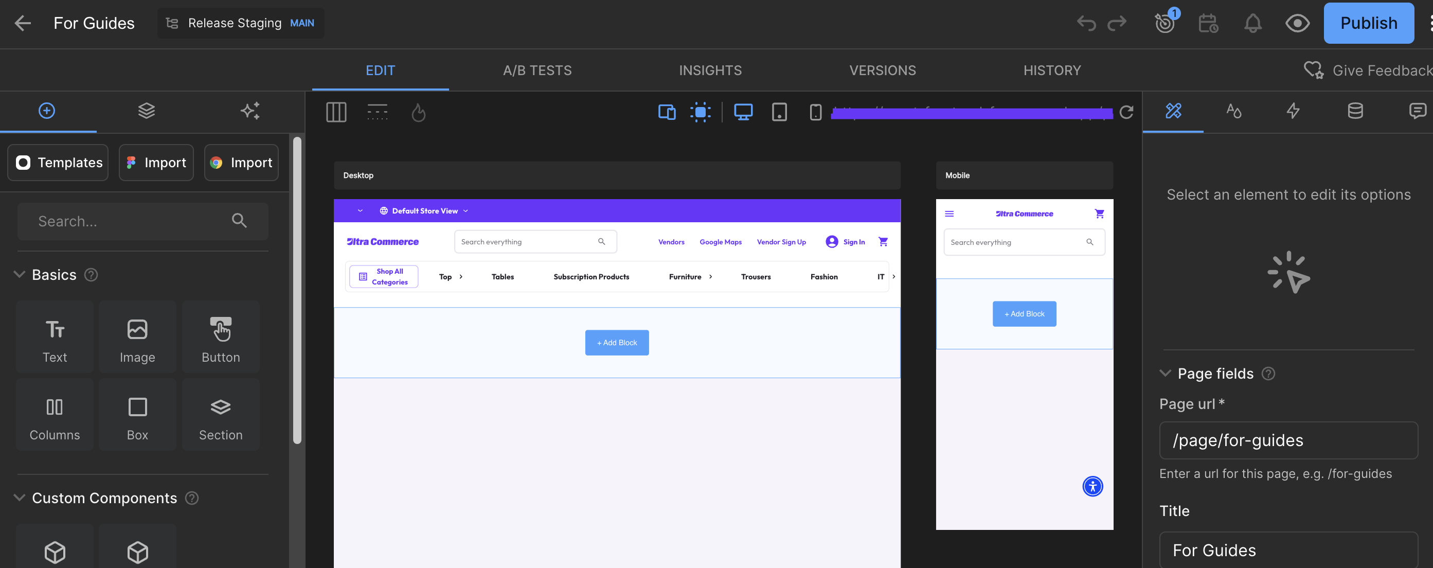
There are 2 primary tabs to navigate through the layouts which can be found on the left of the UI.
Insert Tab
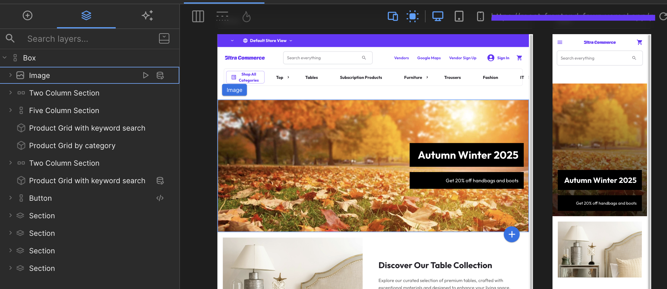
The first tab/icon is the Insert section, which allows you to select various components, and add them into the contents of the page (in the middle). You can simply click on a component to add it automatically into the page, or drag and drop the component from the left section, into the necessary location in the middle section.
Here are simple definitions for some of the components:
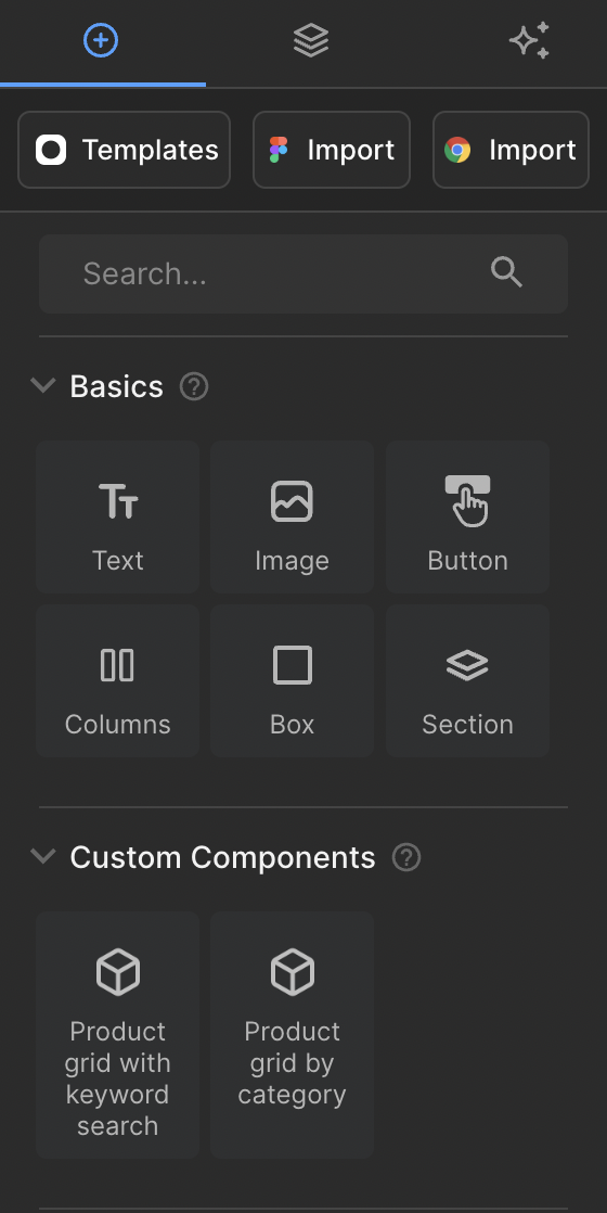
Basics
- Text: This is a simple text box. This can include Headings, Sub-headings, or Paragraphs of text. You can also modify the text/fonts/alignment/layout in the Style tab.
- Image: This is a simple image box. You can upload an image from your device and load it into the page.
- Button: This is a simple clickable button (linked text wrapped in a box).
- Columns: This is used for layouts that require splitting the content into multiple columns.
- Box: This is used to add a solid block or container. You can use this to put content inside of a floating box on top of an image for example, suitable for banners that require a solid block.
- Section: This is typically used to help group rows of content together. Similar to a Box, you can nest content inside the section, which may contain multiple components.
Custom Components
- Product Grid with Keyword Search: This is specific to the Marketplace Integration. This will allow you to insert the product grid from the Marketplace, basing the product results from a keyword search.
- Product Grid by Category: This is specific to the Marketplace Integration. This will allow you to insert the product grid from the Marketplace, basing the product results from a specific Category URL.
Layers Tab
The layers tab shows you an organised tree of nested content that is applied on the page. You can also see the left arrows for each of the layers, which means there are further nested content inside.
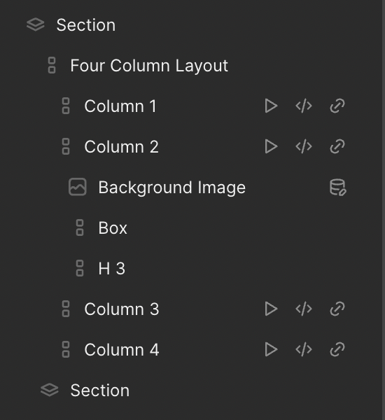
Each layer will have an icon to the left of the name (layers can also be renamed) dictating what kind of component is being used. Some layers will have additional icons to the right to signify that there are additional configurations for that component (eg, animations, custom CSS, dynamic data, or custom links)